Hey friend,
Welcome back to WM Design Opinions, Opinion 3 of 6.
Quick reminder: 30% OFF all plugins + Annual Membership through Dec 5.
Use discount codes:
BLACKFRIDAY30 → 30% off all plugins
ANNUAL30 → 30% off an annual Code Curious membership*
Now, let’s talk about first impressions.
Opinion #3: Not Every Page Needs a CTA Above the Fold
Not every page needs a “Call To Action” button right up front, telling people what to do.
Now, most of the time you do want a nice little CTA up top where people can’t miss it… for example, on the sales page of my membership, I have a “Sign Up” button because I really want you to join, so I’m calling-you-to-action. Sign Up! (no really… sign up!)

But CTA’s can get tiresome and impersonal after a while. A “Sign Up” here, and a “Get a Quote” there (*Old MacDonald tune*).
Sometimes, you don’t necessarily want a conversion; you just want your visitors to feel something. Sometimes we want to tell a story, and the above-the-fold is our opening scene.
The Henson Template in Squarespace 7.0 did this very well.

It had this nice feature that made your first impression of a page focused and calm. No call-to-action. It was just some text, or an image, right up front, then it faded away as you scrolled.
For visual portfolios, photography, film, art, and creative work especially, you may want your visitors to feel something before you ask them to do something. A call-to-action can sometimes actually kill the vibe, especially when it’s given too soon.
In those moments, the most intentional design choice you can make is to allow someone to simply experience and connect with the content before a sales push begins.
That initial “cinematic” moment doesn’t need to be dramatic or flashy. It just needs to be clear, confident, and unobstructed. When it’s done right, it gently pulls the person into the site instead of pushing information at them all at once.
To me, it’s not about design flair, it’s about respect for the work being shown.
Oh. Wow. I have a plugin for this. Who knew?
Scroll Away Hero (Free for Members)
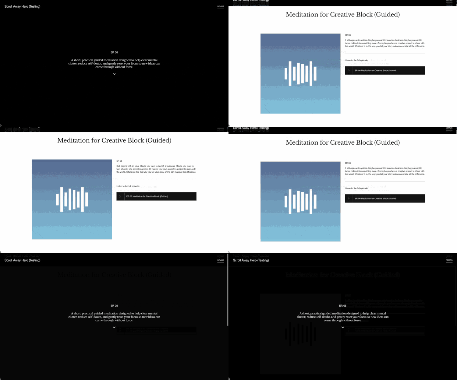
Create a cinematic first impression. Sometimes, the most powerful thing you can do is let your work speak first. A full-screen hero that holds your visitor's attention, then gracefully fades as they scroll to explore more.
Perfect for:
Visual portfolios & photography sites
Film, art, and creative work
Magazine-style blog covers
Portfolio item intros
Check Out Scroll Away Hero Plugin
(Free for Code Curious Members)
Get it 30% OFF for Black Friday Or unlock it inside the Annual Membership
Next weeks opinion - Structure is more powerful than decoration.
Keep building,
Will
* Current members can upgrade following these instructions
Code Curious Membership
Code Curious is my membership for professional Squarespace designers. As a member, you get:
Robo-Will, your AI Squarespace Code Assistant
20% off all plugins & multi-use licenses
The Code Catalogue with exclusive access to over 100 copy-and-paste code snippets
A Slack Community for you to engage with other Squarespace Designers
Priority Support on plugins and tutorials
$15 / mo or $150 / yr
Use coupon code: ANNUAL30 for 30% off an annual Code Curious membership (That’s only $105 for the first year!)
Cancel anytime.